In Japanese, bouten 傍点, "side marks," are dots written in the furigana 振り仮名 space that express emphasis. They work like italicized text, or bold text. To emphasize a phrase, every pronounceable character of the phrase gets a dot beside it—punctuation doesn't get dots.
Definition
The side dots are used to mark important text in Japanese, emphasizing it. This emphasis may serve diverse functions, like:
- Marking shocking or surprising information.
- Stressing that a statement is a fact, or that a detail exists and is relevant in a situation.
- Stressing something that may be disregarded or overlooked by the reader.
- As a [sic], to indicate a word that appears misspelled by mistake was deliberately spelled that way.
- To indicate something is a wordplay.
- Emphasizing something which a character reacts to, the word that gets on their nerves, which they take insult on.
- Historically, they've been used instead of dakuten 濁点.(小松, 1971:146)
- dakuon-gana ni subete dakuten ga kuwaerareru you ni natta no wa zutto ato no jiki no koto de atte
濁音仮名にすべて濁点が加えられるようになったのは、ずっとあとの時期のことであって
The practice of putting accent marks (dakuten) in all accented kana happened much later. - sono katoki ni kenten ni yoru fudakuten ga mochiirareteiru koto
その過渡期に圏点による不濁点が用いられていること。
In the transition period the side-dots were used.
- dakuon-gana ni subete dakuten ga kuwaerareru you ni natta no wa zutto ato no jiki no koto de atte
The marked text may be intended to be pronounced with emphasis, or simply pronounced normally. It varies.
Nowadays the side dots are used sparingly, on mere words or syllables, but in the past it wasn't unusual to have entire sentences or headlines covered with the side dots.
- Context: when everything is emphasized, nothing is.
There are multiple names for them:
- bouten
傍点
Side-mark. Side-dot. - kenten
圏点
Circle dots. (because of their circular shape.) - wakiten
脇点
Supporting-dot. Side-dot.
Shapes
The bouten may appear in various shapes:
- • ◦ Dot.
- ● ○ Circle.
- ◉ ◎ Double circle.
- ▲ △ Triangle.
- ﹅ ﹆ Sesame dot / diagonal tick.
Asterisks and other shapes can be used, too. The simple dot or circle is the most common bouten shape, followed by the sesame dot. There's no difference between these. They vary according to the preference of the author.
In some contexts, the X mark, triangle, circle, and double circle may mean "wrong answer," "partially correct," "correct," "and "excellent answer," respectively.
Typically, an author will stick to just one dot shape. If they use two different shapes, there's probably a difference between them, like between italic and bold type: the least used probably adds more emphasis.
Sometimes, authors use a different dot shape depending on the writing direction. For example: using the circle dot in horizontal writing, but the sesame dot in vertical writing.
Placement
The bouten are placed in the space where the furigana would be if the text had furigana, which differs according to the direction Japanese is written: on the right side in vertical writing, or above the text in horizontal writing.
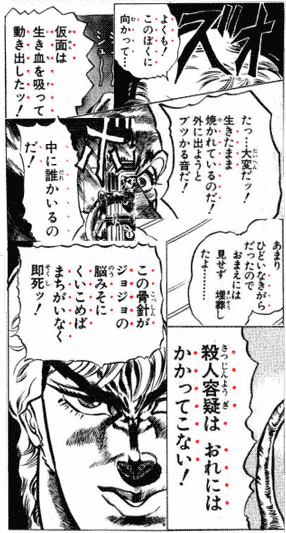
When the text has furigana in all words, e.g. in a shounen manga, things get a bit more complicated. The author may choose one of the following ways to place the dots:
- Add the side dots beside the furigana. (this may not be possible depending on the software used.)
- Remove the furigana and leave only the side dots.
- When emphasizing a whole phrase, skip the characters that have furigana, and only add side dots to the characters without furigana, like the okurigana 送り仮名.
Examples
For reference, some examples of the emphasis dots being used.
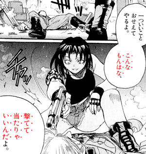
- Context: Revy レヴィ succinctly elaborates her argument against the notion of which the appearance and/or background history pertaining to a firearm is of any importance.
- hitotsu ii koto oseete yaru yo.
一ついいことおせえてやるよ。
[I'll] teach one good thing.
Let me teach you something good.- oseete - same as oshiete 教えて
- konna mon wa na, {{utete} atarya} ii-n-da yo.
こんなもんはな、撃てて当たりゃいいんだよ。
This sorta thing, [you see], {If [you] {shoot and} [it] hits}, [that's enough].- konna mon - contraction of konna mono こんなもの.
- atarya - contraction of atareba 当たれば.
- utete atareba ii
撃てて当てればいい
Good if shoot and hit.
If shot and it hits, that's good enough.
Keyword
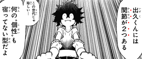
The furigana dots may marks an important word or phrase that readers may miss if unmarked, specially if it carries a deeper in a given context.
- Context: in a series about people that have powers called quirks, a doctor examines Midoriya Izuku 緑谷出久, talks about how quirkless people have two joints in his pinky toe, and then says:
- Izuku-kun niwa kansetsu ga futatsu aru
出久くんには関節が2つある
Izuku-kun has two joints. - {kono sedai ja mezurashii...} {nan'no "kosei" mo yadottenai} kata da yo
この世代じゃ珍しい・・・何の“個性”も宿ってない型だよ
A type {rare in this age}, [that] {doesn't [contain] any quirk}.- yadoru
宿る
To dwell. (in this case, for a quirk to dwell in his body, i.e. for a quirk to be contained in him, for him to contain a quirk.)
- yadoru
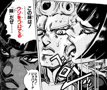
- Context: Bruno Bucciarati ブローノ・ブチャラティ can tell if someone is lying or not by their taste.
- peron'
ペロンッ
*lick* - kono aji wa!
この味は!
This taste [is]! - .........
- {uso wo tsuiteru} "aji" daze......
ウソをついてる『味』だぜ・・・・・・
A "taste" of {spewing lies}......
A "taste" of {lying}......
The taste of a liar......- 『』 - quotation marks.
- tsuiteru - contraction of tsuite-iru ついている.
- uso wo tsuku - "to spew lies," "to lie."
- Joruno Jobaana!
ジョルノ・ジョバァーナ!
Giorno Giovanna!
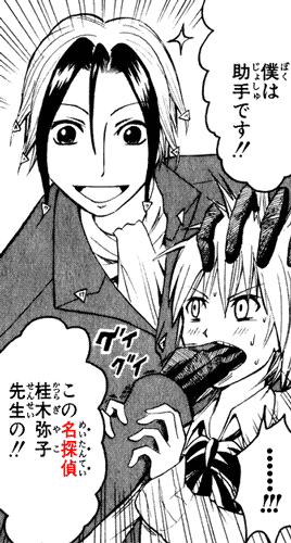
- Context: Neuro, a demon who eats mysteries, solves mysteries to eat them, but pins the work on a human in order to avoid attention.
- boku wa joshu desu!!!
僕は助手です!!
I'm an assistant!! - kono meitantei Katsuragi Yako-sensei no!!
この名探偵桂木弥子先生の!!
Of this famous detective, Katsuragi Yoko-sensei!!
- sensei 先生 - "teacher," "master" of a craft.
- The no の at the end turns the noun into a no-adjective, which normally qualifies what comes after it, but, in this case, it qualifies joshu, which is in a previous sentence.
- sensei no joshu
先生の助手
Sensei's assistant.
Assistant of sensei. - meitantei - "famous/master detective." In mystery novels, the terms that refers to the detective that solves the crime, e.g. Sherlock Holmes.
- In this panel, the word is emphasized with dots because Neuro started calling Yako a meitantei out of nowhere, in order to make it seem it was only natural for her to solve the mystery, since she's a meitantei, but the audience knows it's a huge lie.
Deliberate Misspelling
The furigana dots may mark a word deliberately mispronounced or misspelled in a wordplay.
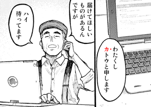
- Context: Satou 佐藤 makes a call using a fake name.
- watakushi φ Katou to moushimasu
わたくしカトウと申します
I'm called Katou.
My name is Katou.- The dot on the ka カ emphasizes Satou gave a slightly different name.
- {todokete-hoshii} mono ga aru-n-desu ga
届けてほしいものがあるんですが
There is something [that] {[I] want [you] to deliver}. - hai, mattemasu
ハイ 待ってます
Okay, [I]'m waiting.- Likely in response to "please wait a moment."
Word Choice
The furigana dots may emphasize an unusual word choice by a character. This may occur:
- When a character is introduced and starts speaking in unusual manner right away.
- When they normally speak casually, and then suddenly start using polite speech, i.e. start ending their sentences with desu/~masu, or vice-versa.
- Switches first person pronouns, specially due to some of them carrying polite and cultural connotations.
- Addresses someone by a different or unusual honorific suffix.
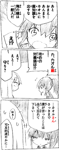
- Context: Tsunashi Youta 十陽太 speaks like an otaku オタク (anime nerd), using sessha 拙者 as first person pronoun and addressing people with a dono 殿 suffix, both word choices only seen in samurai characters in anime, and otaku influenced by such characters. He gets a warning from his brother:
- ato omae... anmari Kaoru ni fu-chishiki wo dasu na
あとおまえ・・・あんまりカオルに腐知識を出すな
[Also]... don't throw too much rotten-knowledge at Kaoru.- fuchisiki - "rotten knowledge," refers to things only a fujoshi 腐女子, "rotten girl (who fantasizes about guys in gay relationships, another type of nerd)" would know about.
- ore no yome wa ippanjin da
俺の嫁は一般人だ
My wife is a normie.- ippanjin
一般人
General person, normal person, who isn't related to an activity.
A normie.
- Not to be confused with riajuu リア充.
- ippanjin
- e!?
え!?
Eh!? - Ka, Kaoru-dono, seme no taigigo wa!?
カオル殿攻めの対義語は!?
Ka, Kaoru-dono, [what] [is] the antonym of seme?- seme - "attack," or "attacker." In gay-shipping terminology, the "top" of a gay relationship. In this sense, the opposite term, "bottom," is uke 受け, "receiver."
- It's a meme that asking someone this question is the easiest way to tell if they're an otaku or not, since an otaku would know about this seme-uke 攻め受け pair, while a normie would say:
- e? eto... mamori?
え?えと・・・守り?
Eh? Erm... defense? - ...Kaoru-san, {sakki made boku ga itta} koto wa subete wasurete-kudasai......
・・・カオルさんさっきまで僕が言ったことは全て忘れてください・・・・・・
...Kaoru-san, please forget everything [that] {I said until [now]}.- In this line, Youta switches from the nerdy ~dono suffix to the normal ~san ~さん suffix, which is marked by dots on the furigana. He also starts using boku as first person pronoun.
- They add emphasis to the ~san suffix and the first person pronoun boku, because normally Youta uses sessha as first person pronoun, and calls other people by ~dono, both things that otaku do, upon learning that Kaoru isn't an otaku, he switches to speaking like a normal person.
- haa...
はぁ・・・
*sigh* - kakyuu-teki sumiyaka ni...
可及的速やかに・・・
As quickly as possible...
Landmine
The furigana dots may mark a word that shouldn't have been used, because using it makes a character snap.
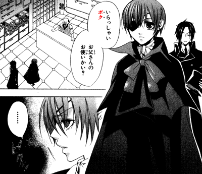
- Context: Ciel Phantomhive シエル・ファントムハイヴ lost his parents and became head of the Phantomhive family. He doesn't like being treated like a child. He enters a store and is greeted by the clerk.
- irasshai boku, otousan no otsukai kai?
いらっしゃいボク お父さんのお使いかい?
Welcome, boy, is [it] [your] father's errand? (literally.)
Are you here doing an errand for your father?- boku 僕 - "boy" (used toward children), also a a masculine first person pronoun.
- piku'
ピクッ
*twitch* (with irritation, in this case.)
In CSS
In a web page, it's possible to add bouten to text using CSS through the text-emphasis properties.
Web browser support for this feature is minimal, around 20% right now.(caniuse.com) This makes sense, after all, this is some ultra advanced CSS Level 3 witchcraft.
Note: the text in Japanese below should appear vertical. If it doesn't, your web browser doesn't support cutting-edge text-rendering features such as literally writing a character on top of another.
As far as I can tell, in Chrome, the circle option is the only one that looks alright.
これぞ
CSSの力!!
text-emphasis: circle;
If you add an open you can make it hollow. For example, next I'll add a hollow triangle. It looks rather small in chrome.
これも
CSSの力!
text-emphasis: open triangle;
The diagonal tick that you see sometimes in manga is done using the sesame option. This one looks extremely minuscule here in Chrome, which is unfortunate. Firefox appears to render it better.
これが
最後だ
text-emphasis: sesame;
There are other options, but this is documented better on Mozilla Developer Network and sites alike, so I guess our CSS journey ends here.
俺達の傍点は
これからだっ!!!
Other Ways to Emphasize Text
In English, we have several ways to emphasize text:
- Bold text.
- Italic text.
- Underlined text.
- All caps.
- Marked text.
- Bigger text.
- All of the above!
Not all of these work in Japanese.
We can mark text, underline text, and make text bigger without a problem.
Japanese doesn't have upper case and lower case, so you can't have text in all caps. In some cases, however, it's possible to add a nuance by deliberately spelling something in hiragana ひらがな or katakana カタカナ.
See Katakana Looks Cool, Hiragana Looks Chummy for details.
There are two ways to make a computer text font bold or italic:
- Design a whole new font based on it, a bold or italic, or bold-italic version of it, with thicker characters, or tilted characters. For example, Arial Black compared to Arial.
- Make a computer program that makes letters thicker somehow. Characters tilted programmatically are said to be "oblique," not "italic," by the way.
English has only a few dozen letters in its script. Other languages that use the Latin alphabet work pretty similarly. Japanese, however, has one hundred kana 仮名 (hiragana and katakana), plus thousands of common kanji 漢字.
See also: jouyou kanji 常用漢字.
Naturally, it's EXTREMELY DIFFICULT to make a whole new Japanese or Chinese font compared to English, simply because there are just way too many characters to design. Nobody is going to make a whole new font with 2100+ characters just to make text bold.
We can still make it bold programmatically, but even then there are issues.
The Latin alphabet letters are pretty simple and easy to write, similar to the kana. The kanji characters, on the other hand, can be very complex, with dozens of strokes, containing several components. Some of them may become illegible if you make the strokes thicker than normal.
Perhaps because of these issues, bold text is unusual in Japanese, and italics or obliques are basically nonexistent.
In print, the side dots are used. On the internet, underlined text is used sometimes, other times the color of the text is changed for emphasis, typically to the red color.
Side Line
When text is written horizontally, it isn't underlined, but sidelined instead. The "sideline" is called a bousen 傍線, wakisen 脇線, or the katakanization saidorain サイドライン.
The sideline can be created with a pencil or pen, but it's also sometimes found in printed media, as a vertical line rendered on the right side of the text.
References
- text-emphasis - caniuse.com, accessed 2021-08-02.
- 小松英雄, 1971. 日本声調史論考. 笠間書房.
Damn, it's amazing how much you know about all this. Not only that, but presenting it in a simple, concise, and entertaining manner. Some people try too hard to be funny on topics like that, so glad you're not like that. Lastly, when my cursor hovered over some of those images, it was literally the first time I saw my cursor horizontally before lol
ReplyDeleteNice article, thanks!
ReplyDeleteHey cool, I've been wondering about this. Thanks!
ReplyDelete